
Rawteen
Rebranded. Revoiced. Reimagined.
Rawteen isn’t just another protein bar — it’s a rebellion in a wrapper. Built to disrupt the snack aisle, we fuse flavor with function and a bold attitude that doesn’t apologize for being different. This is snacking without compromise — because eating well should feel just as good as it tastes.
Task
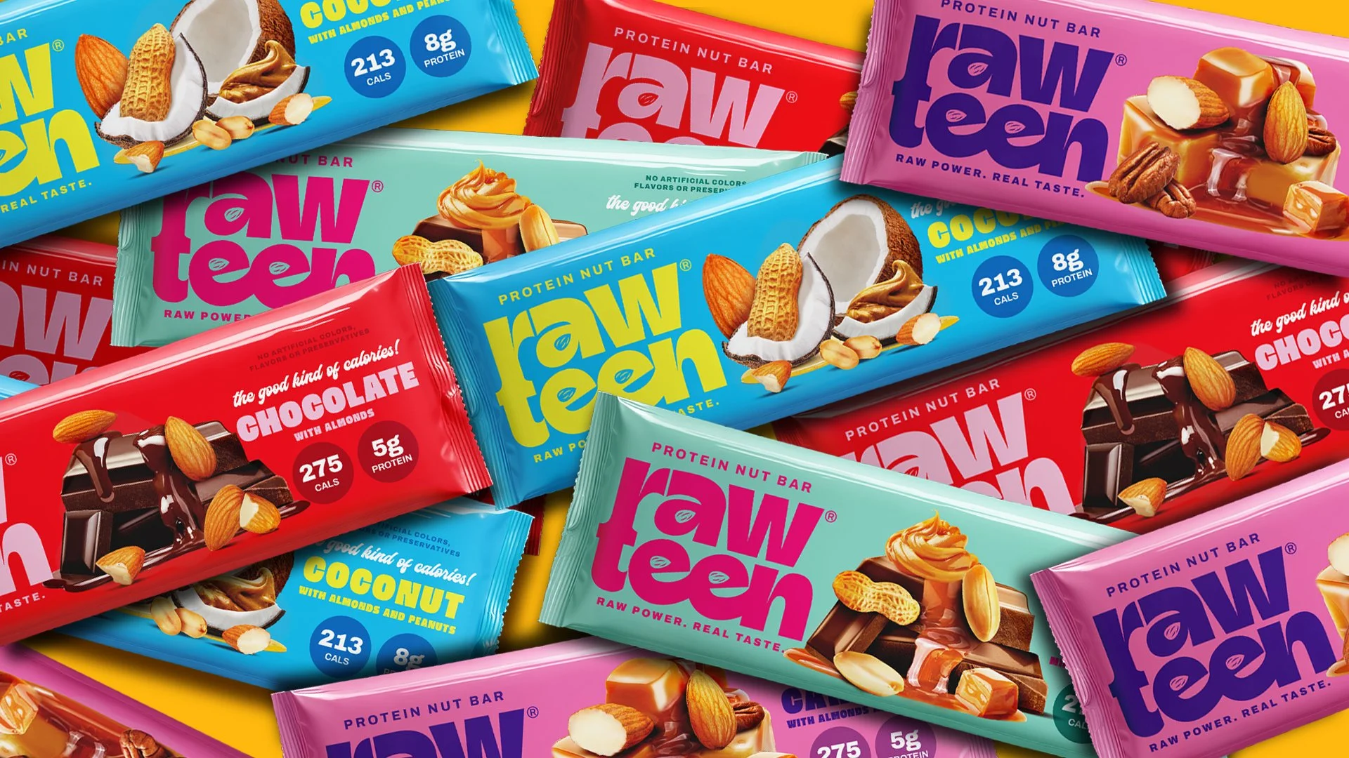
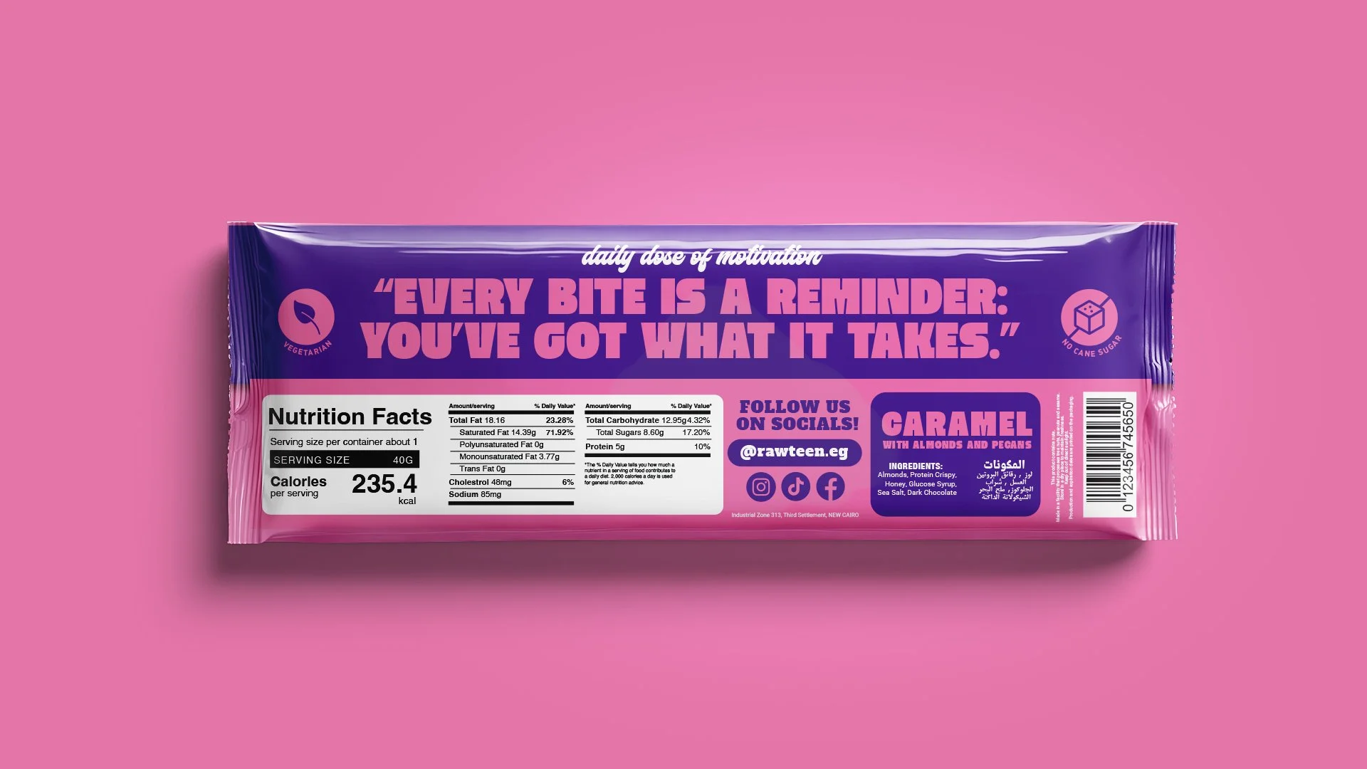
Rebrand Rawteen, a Gen-Z-focused protein bar, to break free from its outdated packaging and disconnected identity. The goal: build a bold, high-energy brand, unapologetic personality, and packaging that commands attention in the snack aisle.
The Evolution
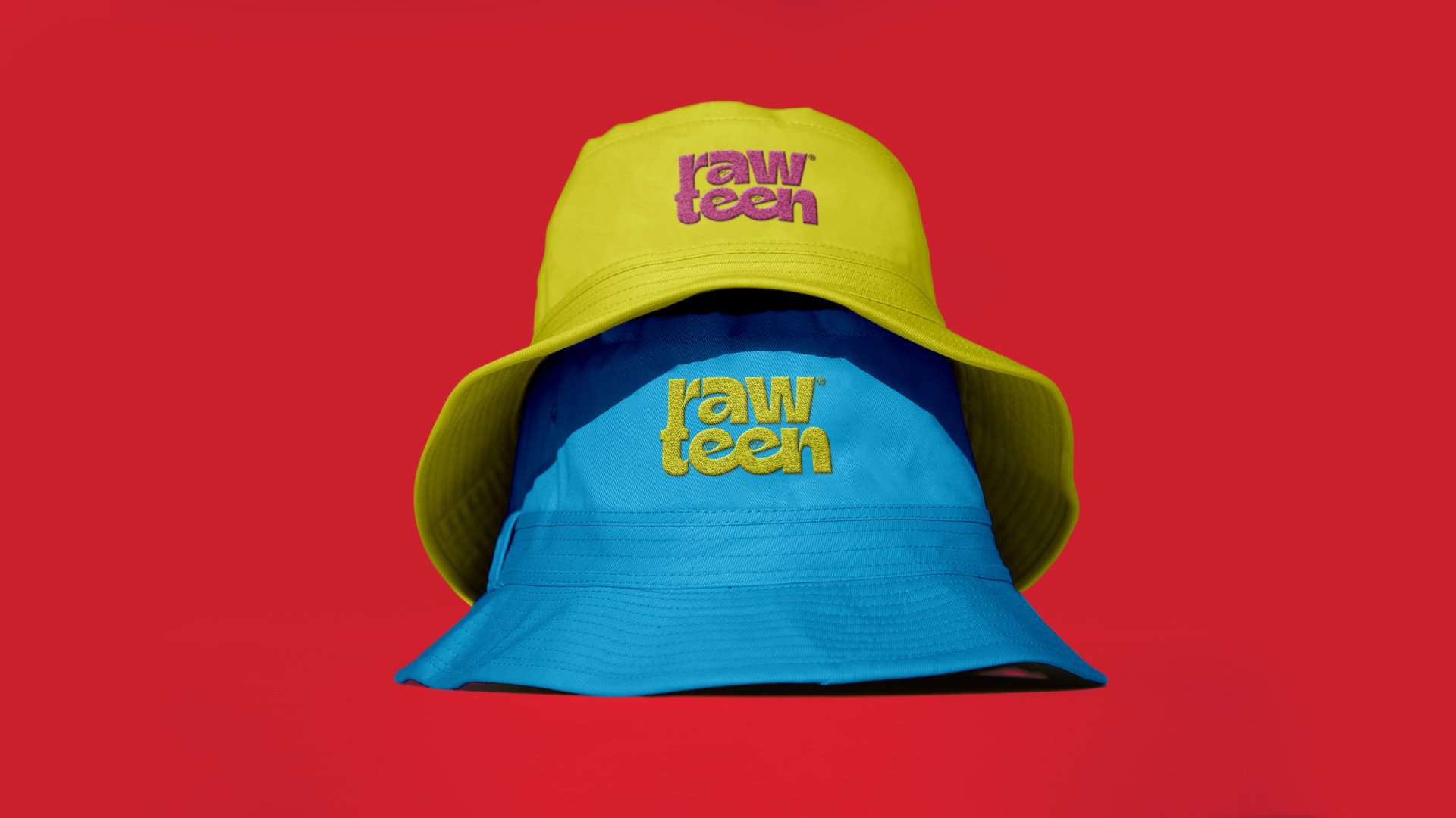
Rawteen’s original logo felt outdated and lacked the energy to connect with a Gen-Z audience. The new logo flips that entirely — bold, expressive letterforms with sharp, high-contrast edges and gives a nod to a wellness and health-conscious brand. Paired with a vibrant color system and animated for digital-first platforms, the new identity brings the brand to life in every sense.
Style & Art Direction
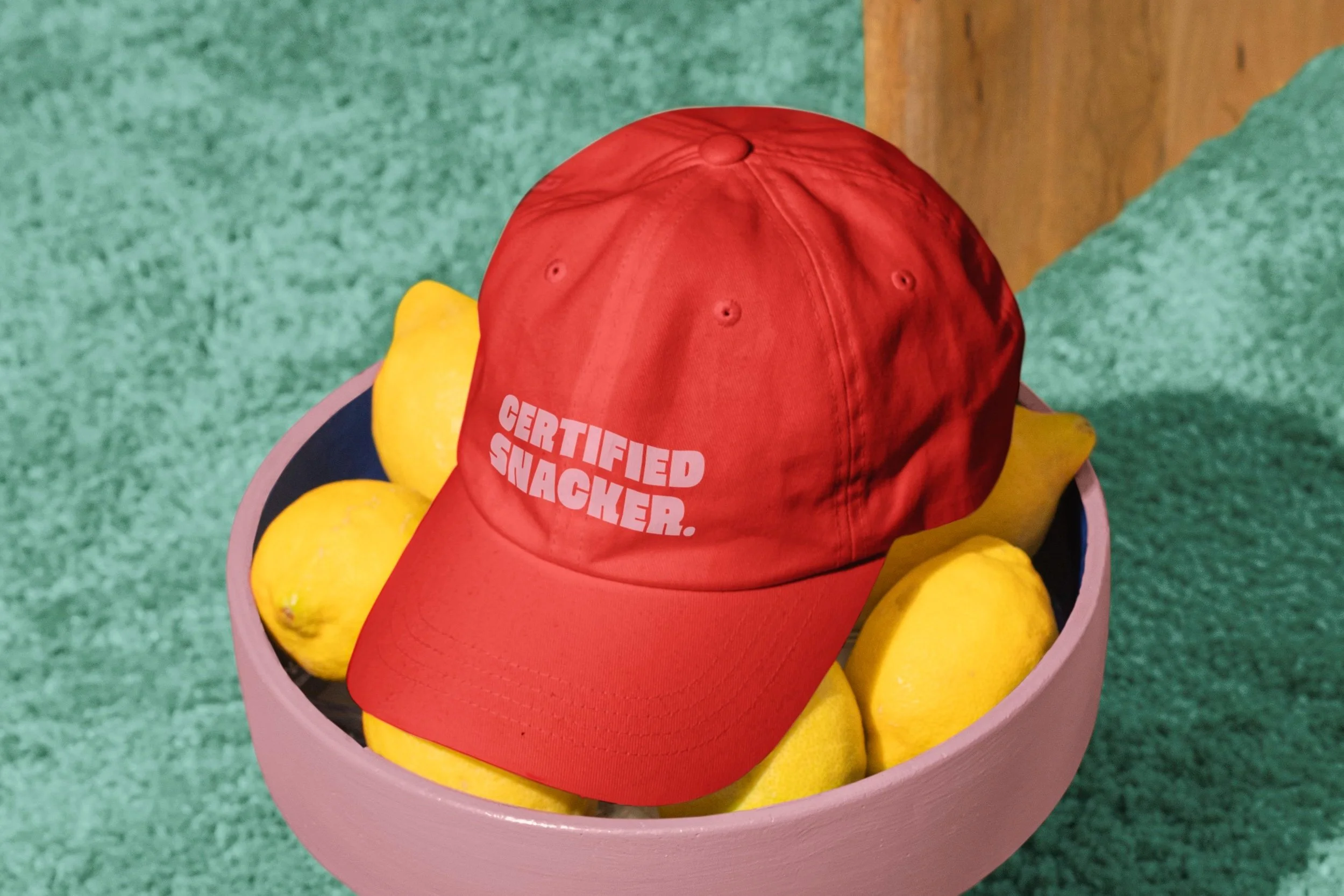
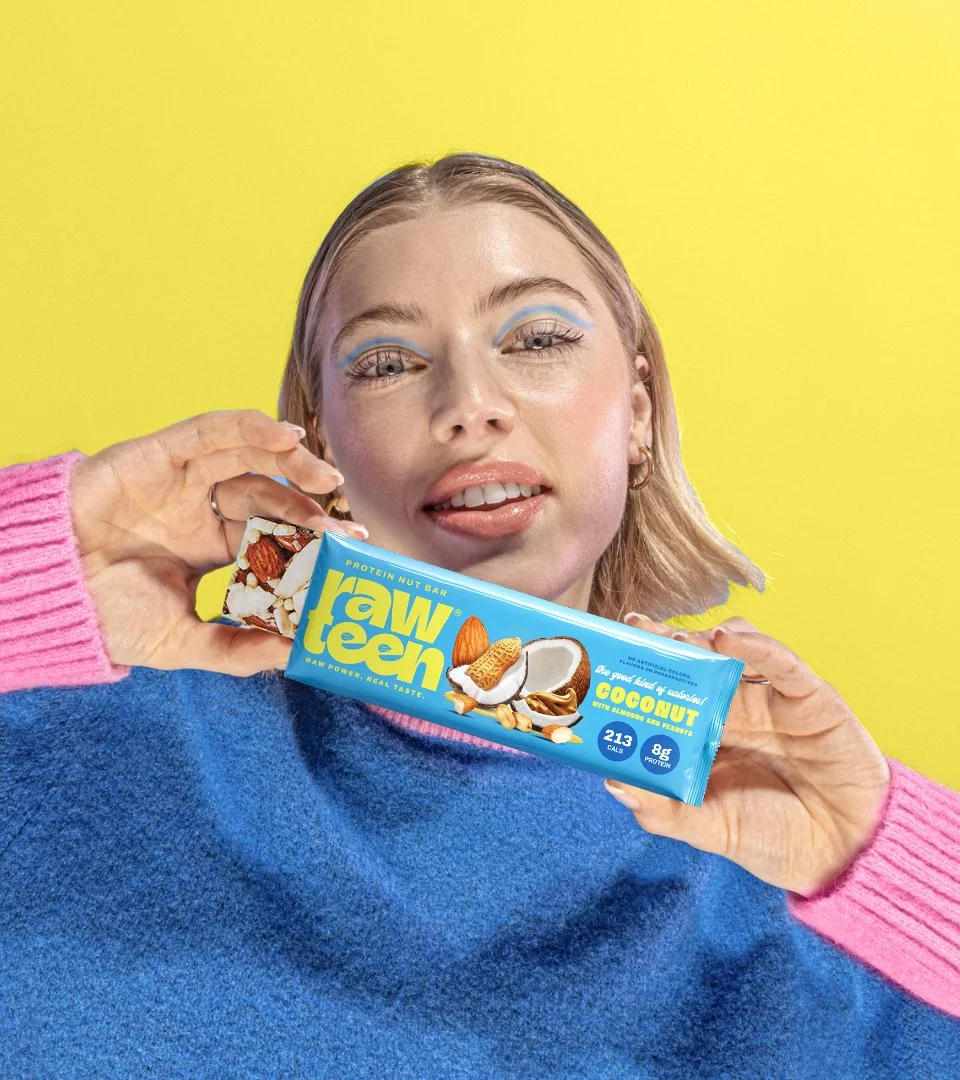
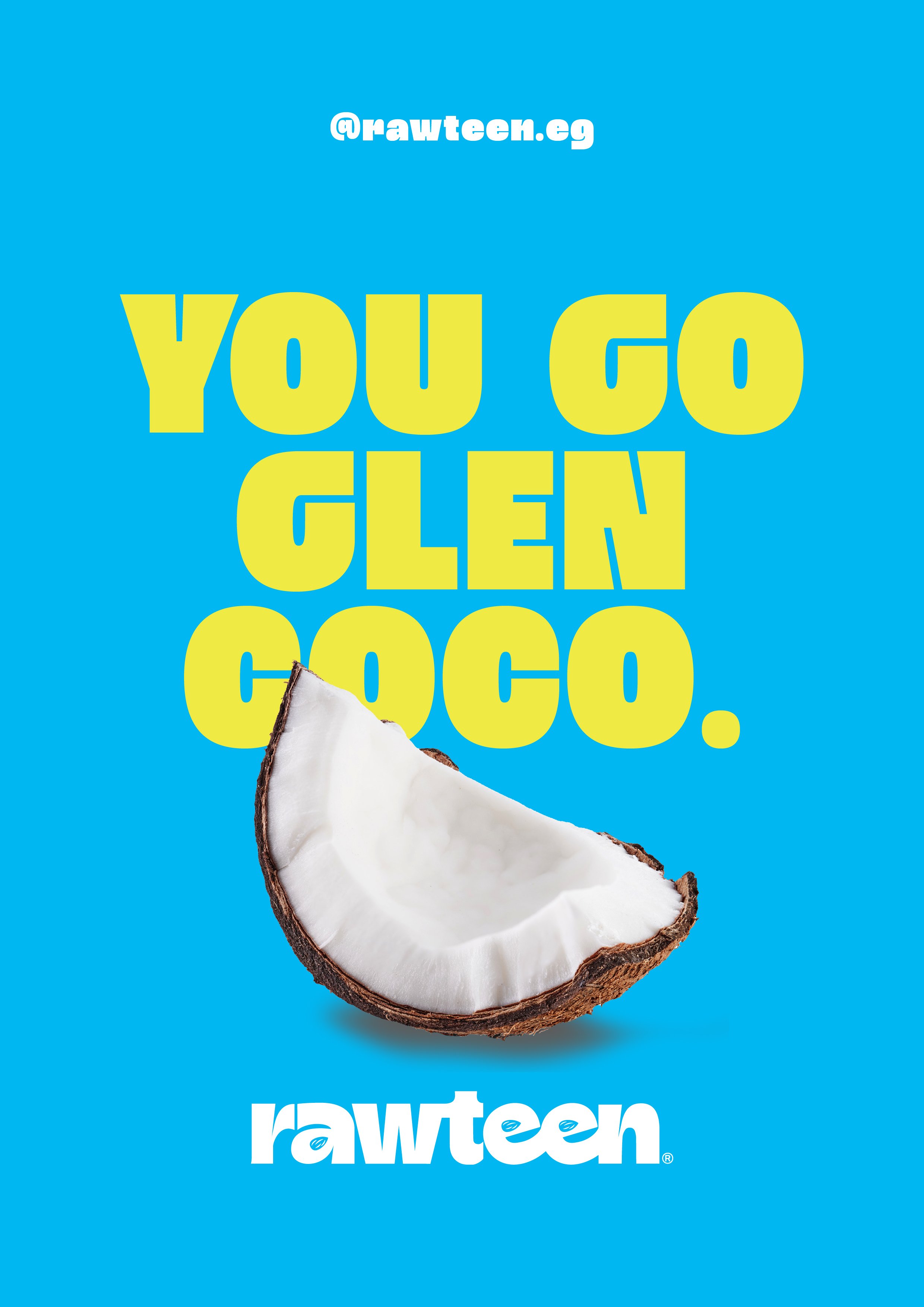
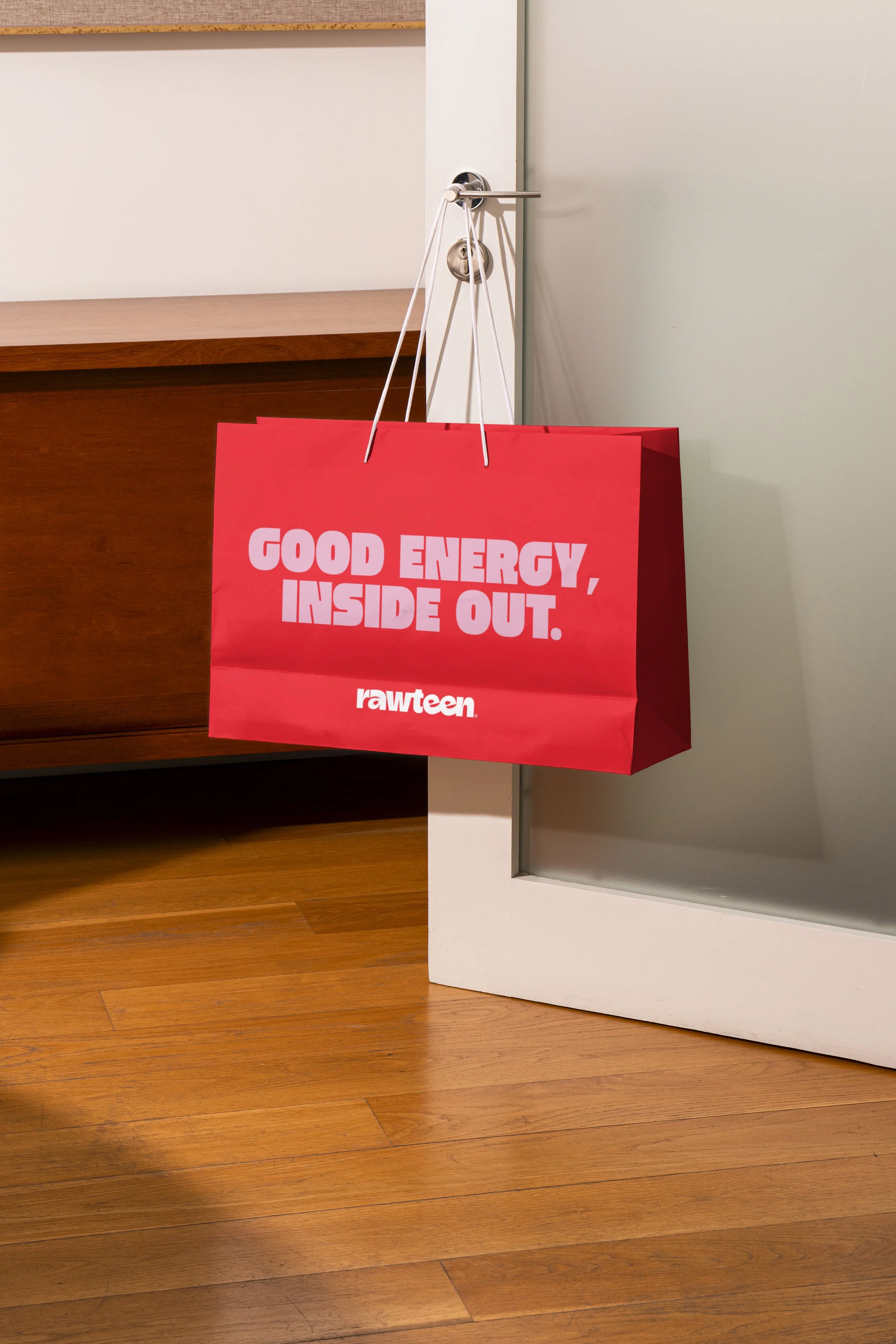
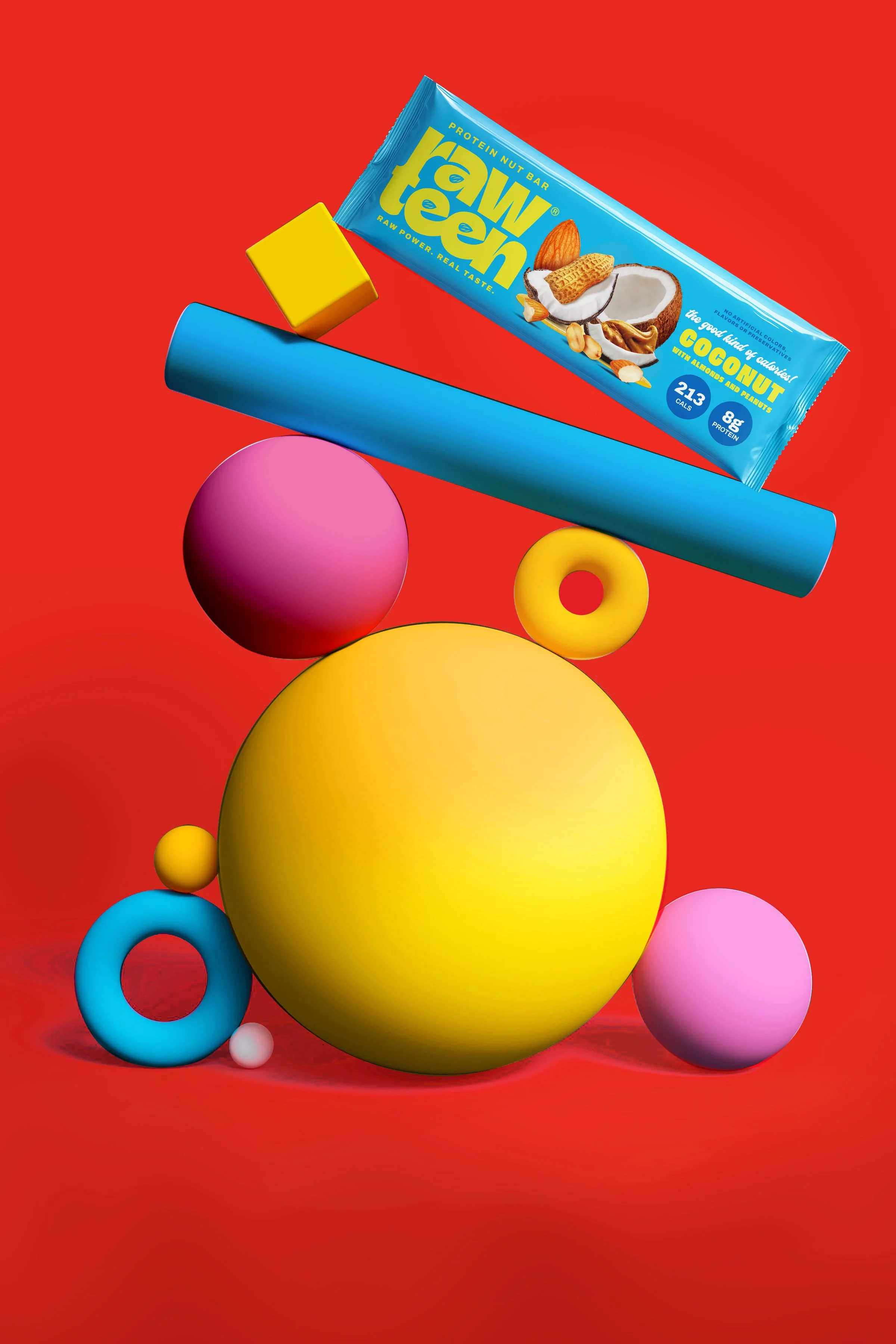
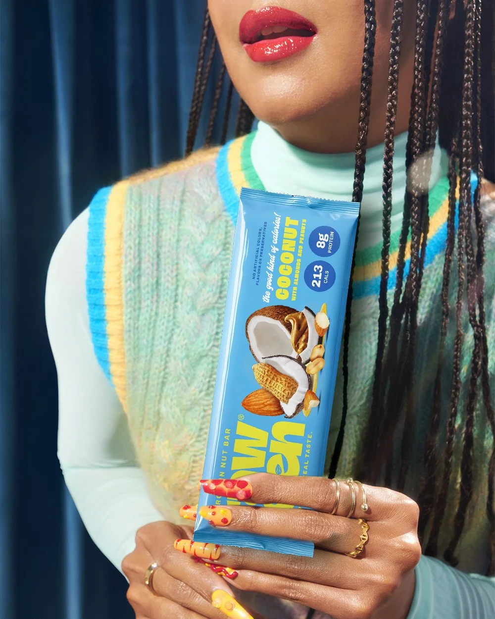
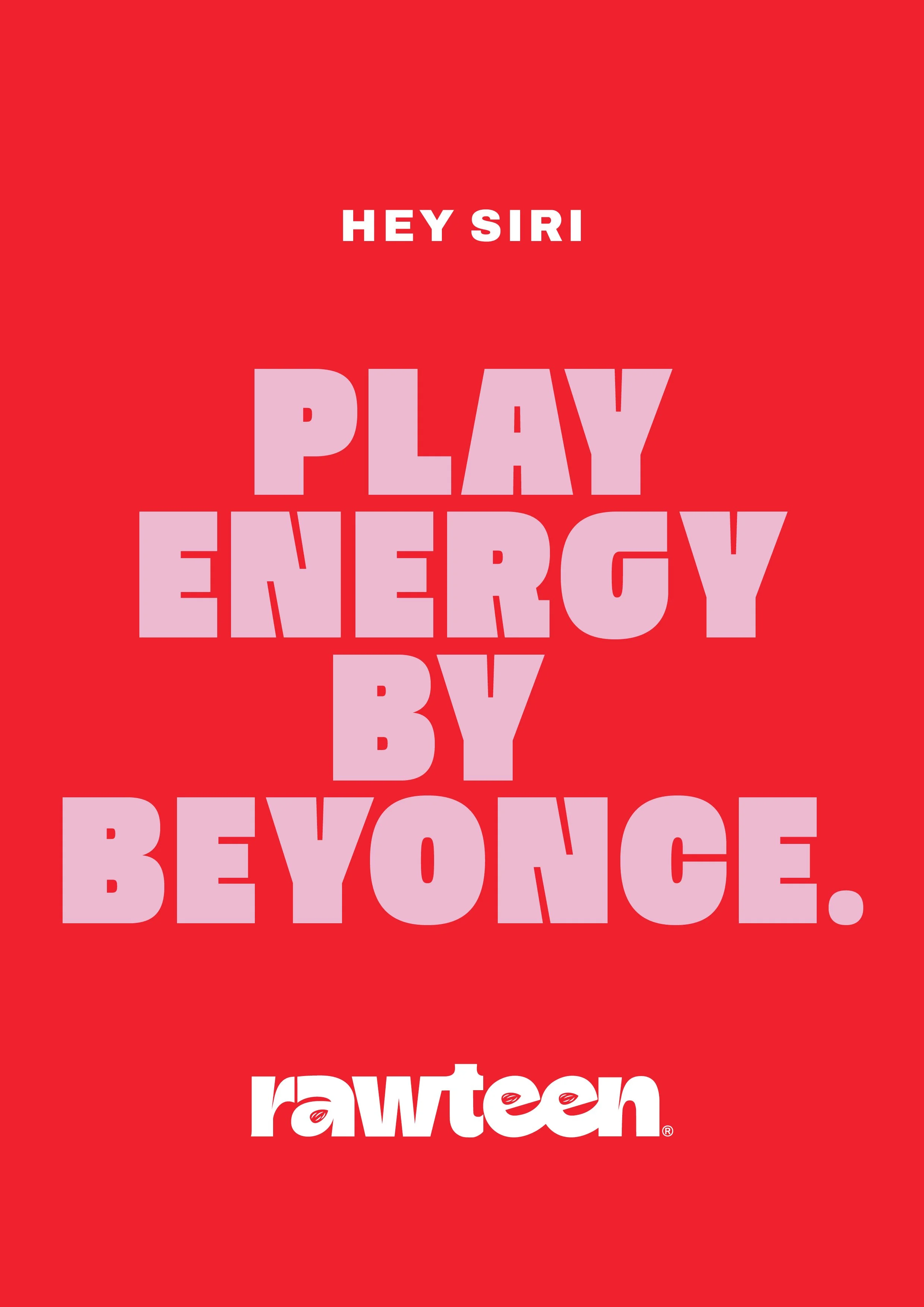
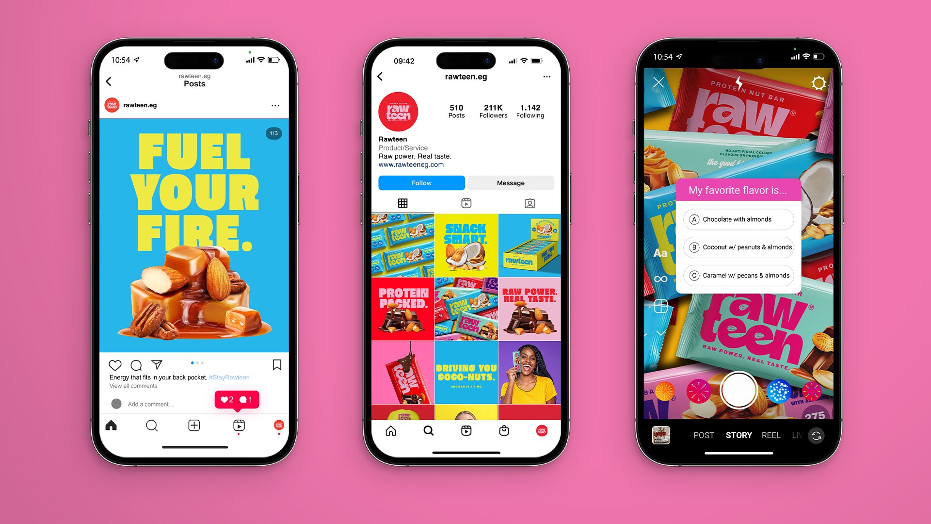
A high-contrast visual world with loud typography, playful imagery, and unapologetic energy. Think Gen-Z culture meets wellness rebellion.
Flavor Treatment
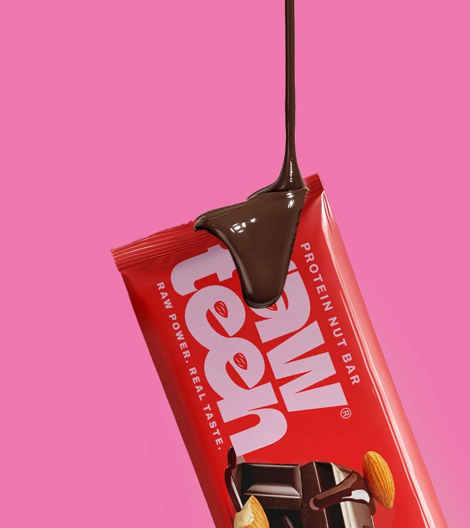
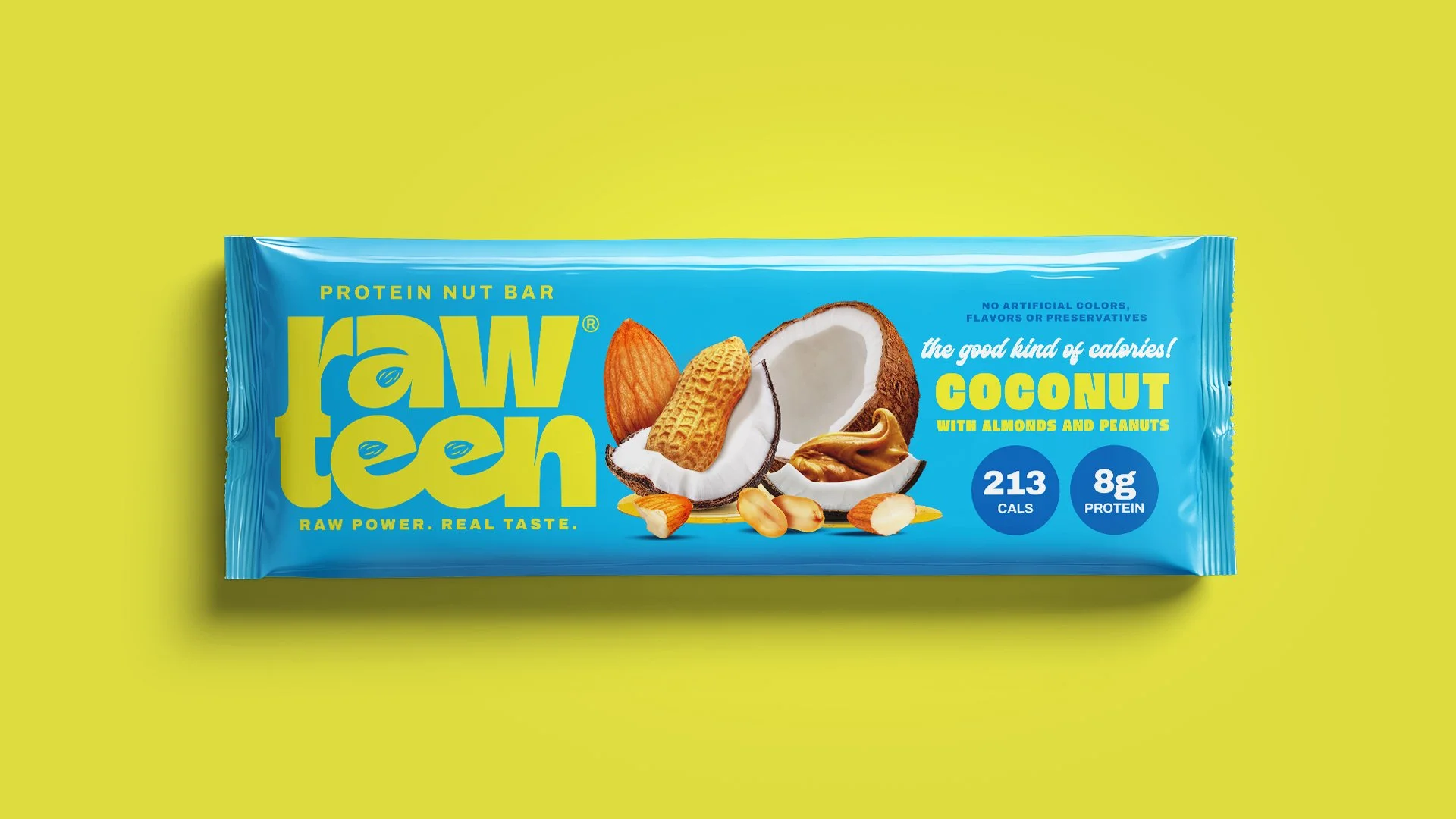
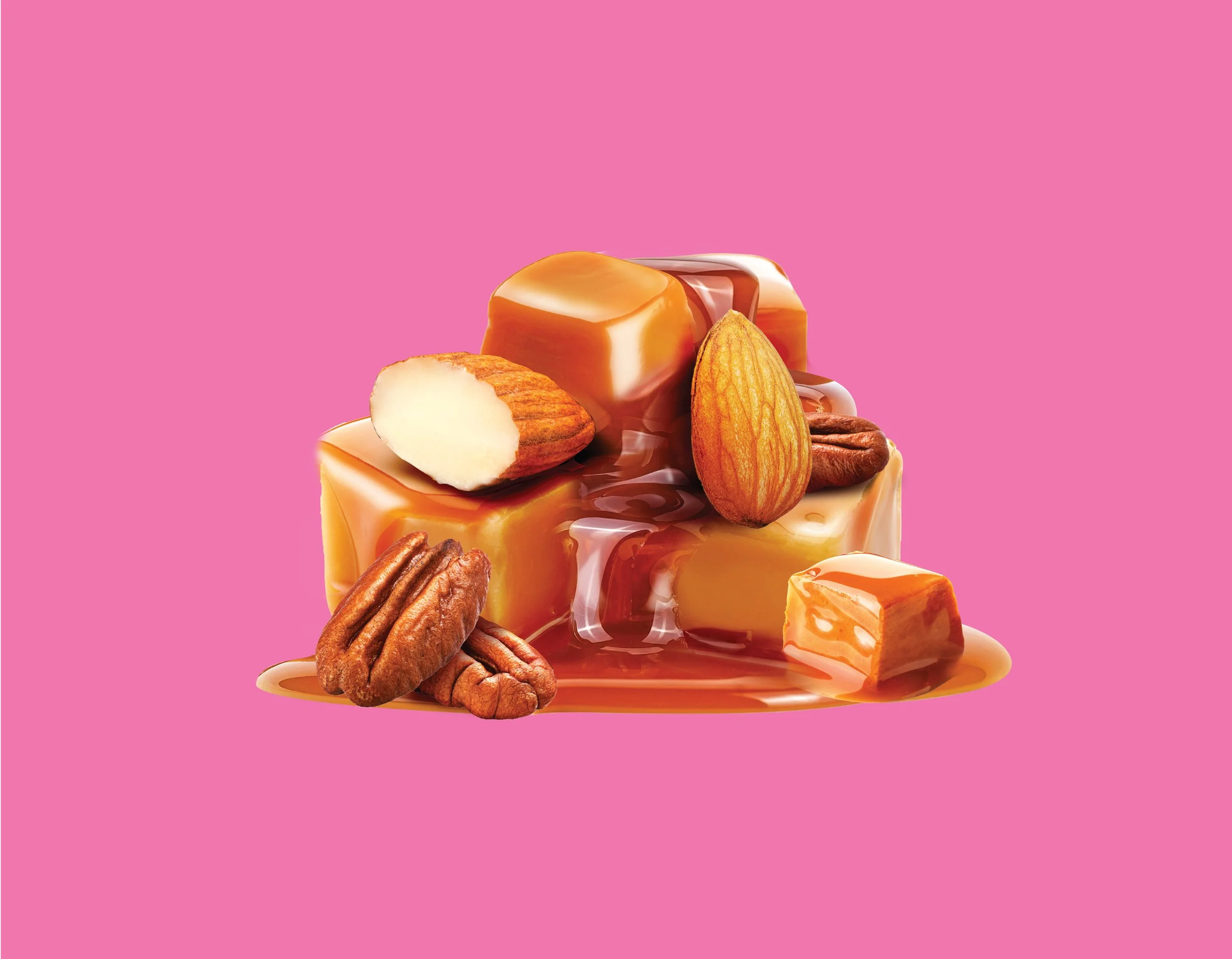
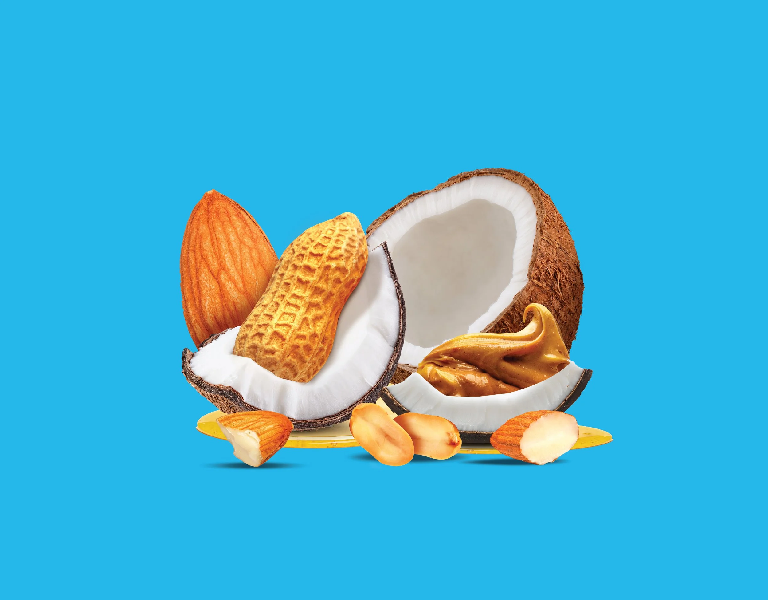
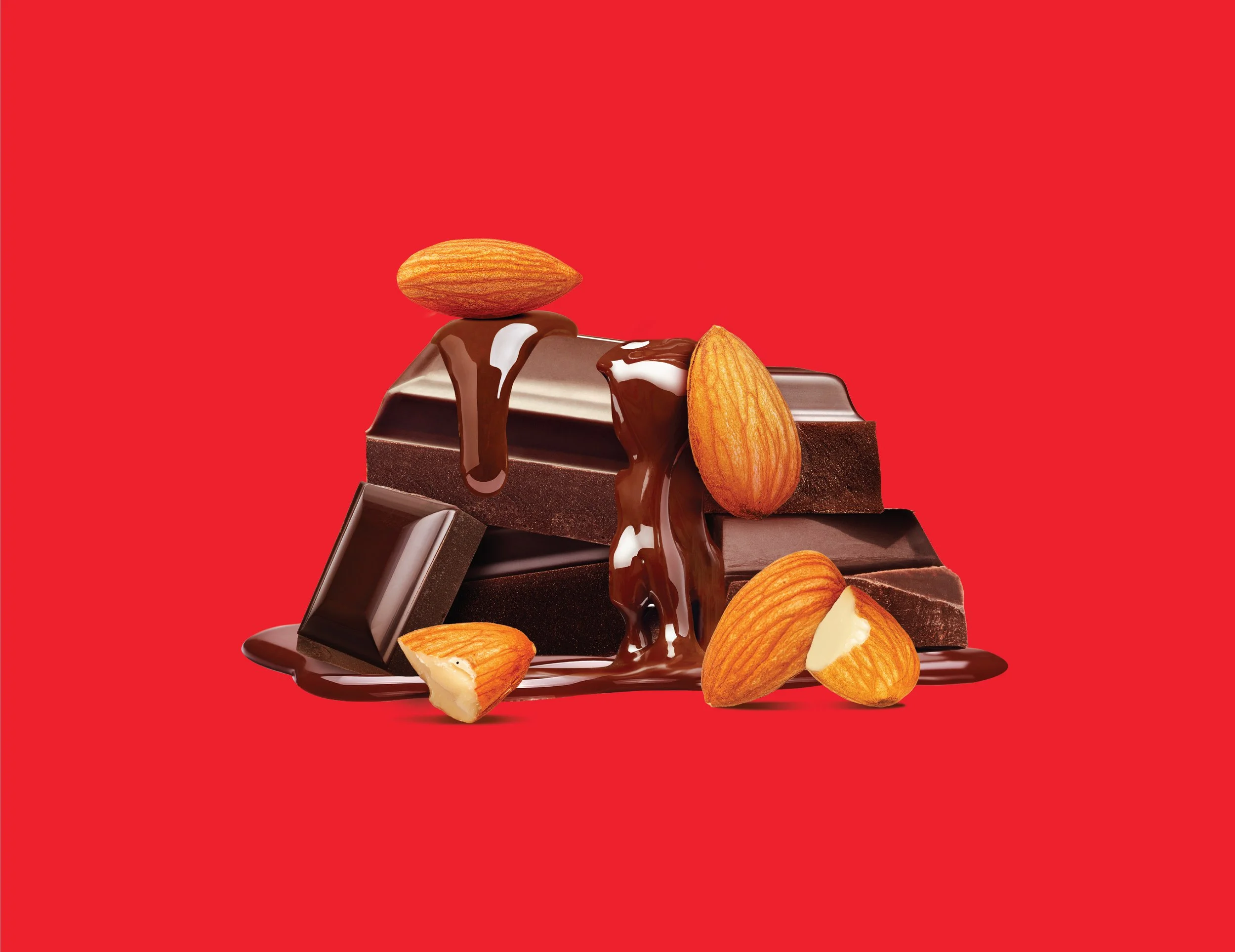
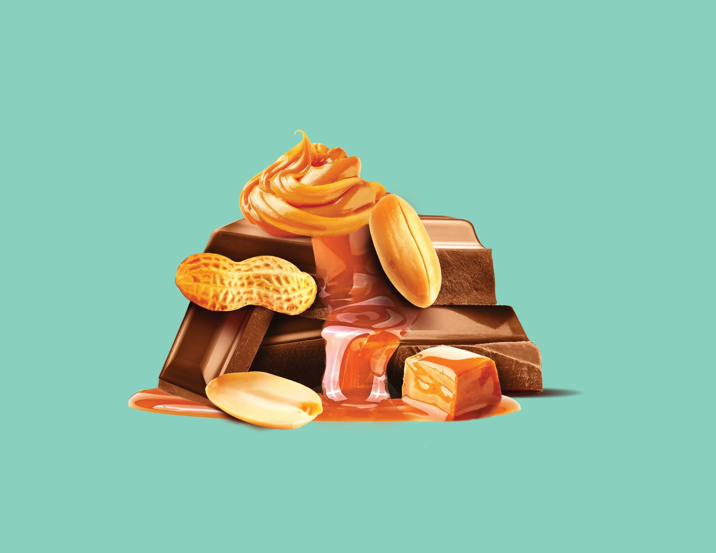
Each Rawteen bar is powered by real, recognizable ingredients — and we made sure they looked just as bold as the brand itself. From melted to caramel to coconut chunks, every element was meticulously retouched and color-corrected to feel rich, crave-worthy, and alive.
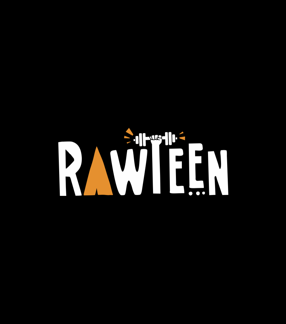
Before
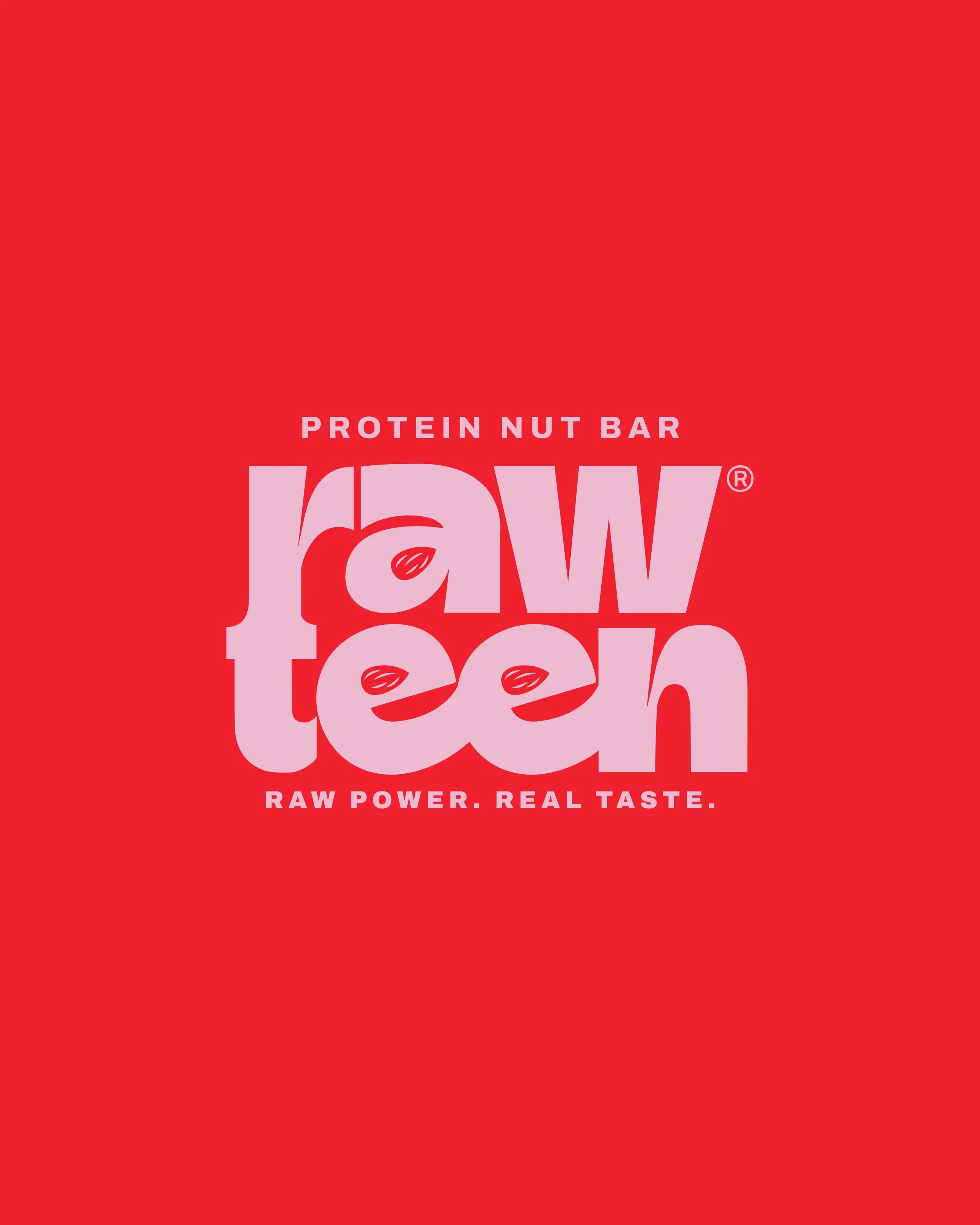
After
Credits
Khadija El Sharawy
Brand Strategy
Concept
Brand Identity
Packaging
Retouching
Motion